Tables
Table Views
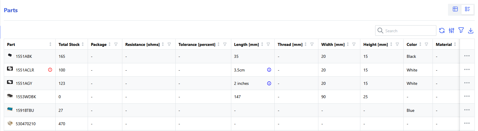
Information throughout the InvenTree interface is often presented in tabular format, allowing users to easily view and interact with large datasets. Tables are designed to be flexible and customizable, providing a range of features to enhance the user experience.

Pagination
The pagination controls are located at the bottom of the table, allowing users to navigate through large datasets by moving between pages. Users can also adjust the number of rows displayed per page using the pagination settings.
Row Selection
For tables where data selection is supported, a checkbox is provided at the left-hand side of each row, allowing users to select one or more rows for further actions. A master checkbox is also provided in the table header, allowing users to quickly select or deselect all rows in the table.
Pagination and Row Selection
When using the "master select" checkbox to select all rows, only the rows on the current page will be selected.
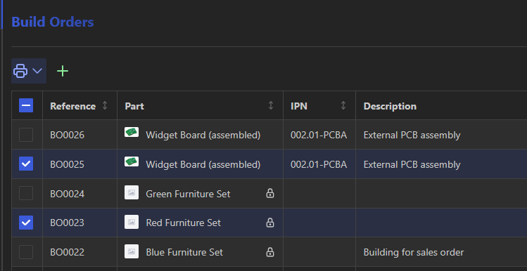
Table Actions
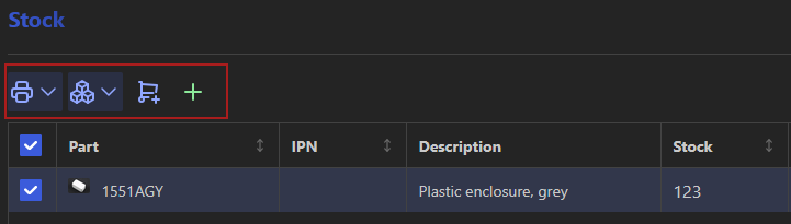
A particular table view may have a set of actions associated with it, which are typically located at the top-left corner of the table. These actions may include options for adding new entries, or performing bulk actions on selected rows.
Searching
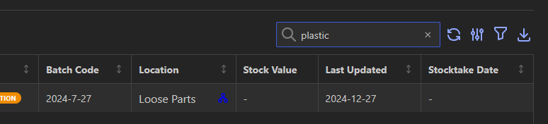
Some tables support searching, allowing users to quickly find specific entries within the dataset. The search bar is located at the top-right corner of the table view:
Column Selection
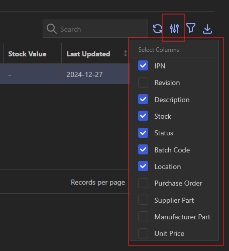
Some tables allow the user to toggle the visibility of certain columns to, enabling a more customized view of the data.
Column selection is accessed via the "Select Columns" menu, located to the top-right of the table view:
Filtering
The dataset (which is fetched dynamically from the server via an API request) can be filtered by providing query parameters to the API endpoint.
Select the "table filters" button to open the filter selection menu
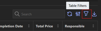
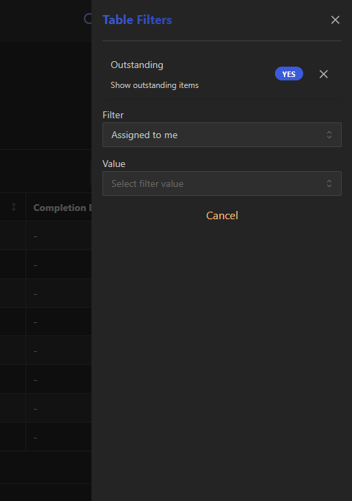
Table filters are saved across browser sessions, allowing users to maintain their preferred filter settings when returning to the particular table view.
Column Filters
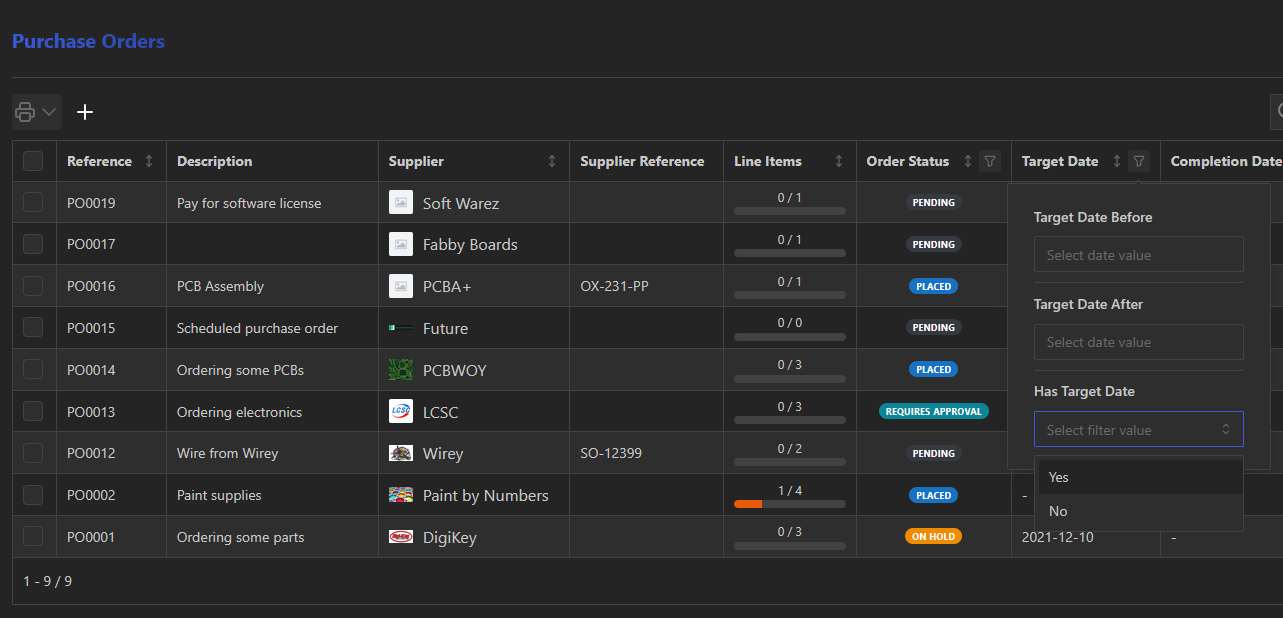
Many table columns expose an inline filter icon directly in the column header, providing a quick way to filter by that column without opening the full filter drawer. Columns that support filtering display a small filter icon alongside the column title. The icon is highlighted when a filter for that column is currently active, giving an at-a-glance indication of which columns have active filters.
Clicking the icon opens a compact popover anchored to the column header:
Single-filter columns — for columns linked to one filter (e.g. Active, Has IPN, Status), selecting a value immediately applies the filter and the popover closes automatically.
Range columns — for columns that represent a range concept (e.g. Start Date, Target Date, Creation Date), the popover stays open and presents multiple controls — for example before and after date pickers — so both bounds can be set in a single interaction.
Once a filter is active, the popover shows a badge with the current value and a remove button (red ×) instead of the value picker. Clicking the × clears only that column's filter.
Column filters and the filter drawer share the same state
Filters applied via a column popover appear immediately in the filter drawer's active-filter list, and filters added through the drawer are reflected in the column icons. Clearing all filters from the drawer also removes any filters set via column popovers.
Saved Filter Groups
Frequently used combinations of filters can be saved as a named filter group, allowing them to be quickly recalled later without having to re-add each filter individually.
The Saved Filter Groups panel is displayed at the bottom of the filter drawer. When one or more filters are active, a Save current filters button is available. Clicking it opens an inline name input — enter a name and press Enter (or click the confirm icon) to save the group. Press Escape or click the cancel icon to discard.
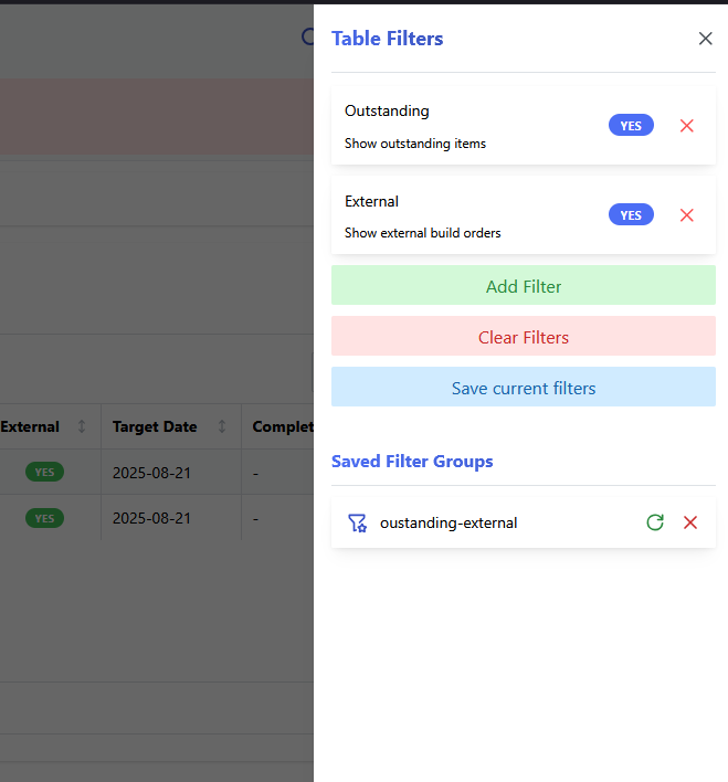
Previously saved filter groups are listed in the panel. Each entry shows the group name alongside two actions:
- Load (green reload icon): Replaces the current active filters with the filters stored in that group. The table immediately re-fetches data using the restored filters.
- Delete (red × icon): Permanently removes the saved filter group.
Saved filter groups are stored in the browser's local storage and are specific to each table or calendar view, so groups saved for one view are not available in another. They persist across local browser sessions until explicitly deleted. Filter groups are not shared to other devices.
Loading a filter group replaces active filters
Loading a saved filter group replaces all currently active filters with those stored in the group. Any unsaved active filters will be overwritten.
Data Sorting
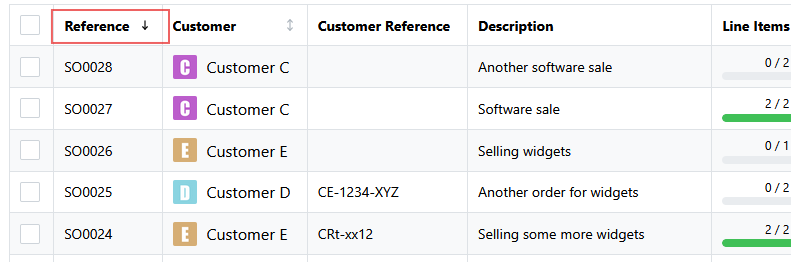
Some table columns support data sorting, allowing the dataset to be sorted in ascending or descending order based on the values in that column. To sort a column, click on the column header. Clicking the column header again will toggle the sort order between ascending and descending. The current sort order is indicated by an arrow icon in the column header.
Data Export
Some tables support downloading of the dataset in various formats (e.g. CSV, Excel, PDF). If data download is available for a given table, the "export data" button will be located at the top-right corner of the table view.
This opens the "Export Data" form, which allows the user to select the desired file format for download, as well as any additional options related to the data export.

Row Actions
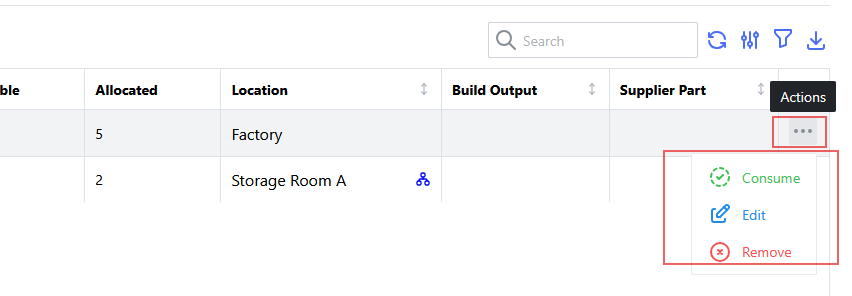
In some tables, there may be specific actions associated with individual rows, allowing users to perform actions directly on a particular entry in the dataset. Row actions are typically accessed via an "actions" menu located at the right-hand side of each row.
Right-Click Context Menu
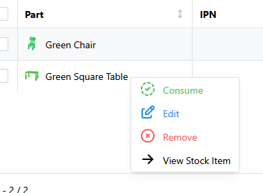
For rows that support row actions, a right-click context menu is also available, providing quick access to the same set of actions without needing to click on the "actions" menu.
Row Navigation
For tables which reference other objects within the system, clicking on a row will navigate to the detail page for that particular entry. For example, clicking on a row in the "Part" table will navigate to the detail page for that specific part.
If the preview panel feature is enabled, clicking on a row instead opens a preview drawer for that entry, rather than navigating directly to its detail page.
Calendar Views
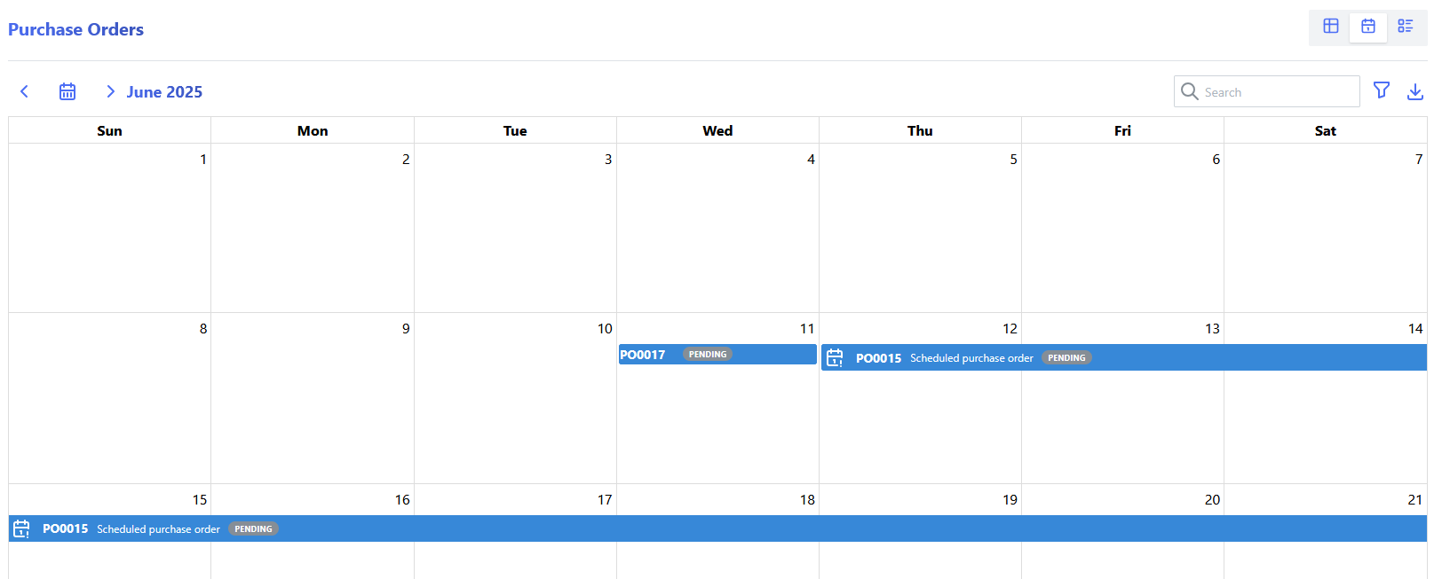
Some table views associated with various order types can be switched to a calendar view, which provides a visual representation of data based on date fields. The calendar view allows users to easily see and interact with data that is organized by date, such as scheduled tasks, events, or deadlines.
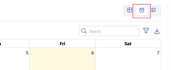
To switch to the "calendar view" (for a table which supports it), click on the "calendar view" button located above and to the right of the table view:
This will display the data in a calendar format:
Calendar Horizon
The calendar view provides a configurable "horizon" setting, which allows users to adjust the number of months displayed in the calendar view.
Parametric Views
Some table views can be switched to a parametric view, which provides a visual representation of data based on specific parameters or attributes. The parametric view allows users to easily see and interact with data that is organized by certain characteristics, such as categories, types, or other relevant attributes.
To switch to the "parametric view" (for a table which supports it), click on the "parametric view" button located above and to the right of the table view:
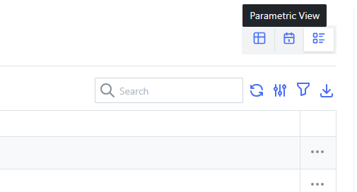
This will display the data in a parametric format: